Case study 08 of 10 · Marketing site · Independent concept project

Morgan & Morgan

A clearer path to legal help for people who fear the cost of asking.

2 min read
Role
Sole UX/UI designer, end to end
Type
Independent concept project
Year
2021
Platform
Responsive web
Scope
Competitor analysis, user journey, design system, hi-fi homepage, usability test plan
Industry
Legal services
Authorship

An unsolicited, unaffiliated concept study built around the existing Morgan & Morgan law firm brand. The name, marketing claims, and identity belong to the firm, while the research, flows, screens, and design system shown here are my own exploration, never commissioned, reviewed, or shipped by anyone at Morgan & Morgan.

The hard part

Earning trust from stressed, first-time visitors fast enough that they act before hesitation about cost and outcome wins.

Look for

How every section answers one objection in sequence: can I trust them, can they win, what will it cost, what do I do now.

The biggest barrier to legal help is asking

People with a real case often never contact a firm, because cost feels unknowable, outcomes feel uncertain, and the process feels built for lawyers, not for them. Accident victims land on a law firm's homepage in a stressful moment, and most firms answer with dense navigation, vague credentials, and no clear first step. The homepage had to convert hesitation into a single low-risk action: a free case evaluation.

  • Upfront cost fears stop people from finding out whether their case is even viable.
  • Firms rarely show real results, so visitors have no way to judge credibility.
  • Confusing structure and jargon leave people unsure where the process starts.

A competitor pass across firms like Cellino & Barnes, Jacoby & Meyers, The Barnes Firm, and Law Tigers showed strong brands undercut by dated design, crowded layouts, and buried consultation paths.

One page, four objections, one action

The homepage is sequenced as an argument: establish credibility, prove results, remove the cost objection, then make the ask trivially easy.


Dark hero section with a group photo of attorneys, a bold recovered-for-clients headline, a phone number in the top bar, and a yellow free case evaluation button.
The hero leads with recovered results and a phone number in the header, so the highest-intent visitors can act without scrolling.
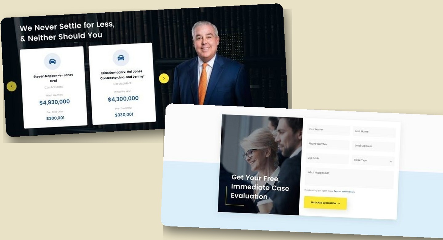
Navy section titled We Never Settle for Less with two white case cards, one showing a $4,930,000 award over a $300,001 pre-trial offer and the other a $4,300,000 award over a $330,001 offer, beside an attorney portrait.
Result cards pair each final award with the pre-trial offer to argue the firm never settles cheap. The amounts are illustrative concept figures rather than verified case outcomes.
Light section titled We fight For The People with short paragraphs of plain-language copy beside a photo of a gavel resting on a book and cash.
A quiet values section states who the firm fights for in plain language, giving hesitant visitors a reason to believe before the ask.
Light comparison section titled It's Free Unless We Win with two columns comparing retainer based and contingency based models, every line in both columns marked with an identical checkmark, above a yellow CTA button.
A side-by-side table contrasts retainer and contingency billing right before the evaluation CTA. One flaw survives in this frame: both columns reuse the same checkmark bullet, so retainer drawbacks like pay even if you lose read as endorsements, a detail the next pass would swap for cross marks.
Form section titled Get Your Free, Immediate Case Evaluation with fields for name, phone, email, and zip code, a Case Type dropdown, a what happened text area, and a yellow Free Case Evaluation button beside a photo of two lawyers with a client.
The closing section makes the ask trivially easy: a short form beside a reassuring photo of counsel with a client, ending in one unmistakable yellow Free Case Evaluation button.

How I planned to test the argument

Learn about the firmJudge if they can winUnderstand the cost modelSchedule a consultation

A moderated walkthrough of this page could show whether first-time visitors understand the cost model, believe the credibility signals, and find the evaluation form without help. It could not show whether a stressed claimant with a real case would trust a concept page enough to act, so any claim about conversion stays out of reach.

This is the plan for evaluating a concept, not an account of sessions that ran. The study reports no participants, no quotes, and no findings, and none of its claims rest on observed use.

Appendix: foundations and system

The system underneath the page: a trust-first palette, a heavy Poppins type scale, and a button set built around one unmistakable yellow action.


Primary color swatches on a dark board: Sonic Blue, pale Icy Landscape, and bright yellow Pac-Man with hex values.
Deep blue carries authority, icy blue softens it, and a single loud yellow is reserved for the actions that matter.
Button component sheet showing yellow filled, outlined, text-only, and circular icon buttons in default and disabled states on a dark background.
Button states from filled yellow to ghost and icon-only keep one action color while giving secondary paths quieter forms.
Next storyDuradry →