Case study 09 of 10 · DTC e-commerce · Independent concept project

Duradry

Selling a three step treatment routine to people burned by products that promised dryness and delivered irritation.

2 min read
Role
Sole UX/UI designer, end to end
Type
Independent concept project
Year
2023
Platform
Responsive web
Scope
Competitor analysis, user journey, design system, hi-fi UI, usability test plan
Industry
DTC personal care
Authorship

An unsolicited concept study built around the existing Duradry brand, with which I have no affiliation. The brand, products, and photography belong to their owners, while the research, flows, screens, and system work shown here are my own exploration and were never commissioned or shipped.

The hard part

Buyers arrive skeptical after failed products, so the page has to earn clinical trust before it can ask for a subscription.

Look for

How every section converts a trust objection, irritation, complexity, lock-in, into a concrete answer before the CTA repeats.

The customer has already been disappointed

People with hyperhidrosis are not browsing for a deodorant, they are hunting for a treatment they can finally believe in. Duradry is a three product system for excessive sweating, sold one time or by subscription. The store has to explain a nightly and morning routine, back its clinical claims, and remove subscription anxiety, all inside one scrolling page.

  • Repeated product failures leave shoppers assuming the next promise of dryness is also empty.
  • Strong formulas are associated with stinging and irritation, so safety needs as much airtime as strength.
  • Rigid subscriptions make people feel locked in before they have even seen results.

Desk research covered three U.S. competitors, Certain Dri, SweatBlock, and Carpe, mapping their positioning, FDA status, and the complaints in their reviews.

One page that answers objections in order

The homepage walks a skeptical buyer from the problem, to the routine, to the evidence, repeating one twenty dollar entry offer throughout.
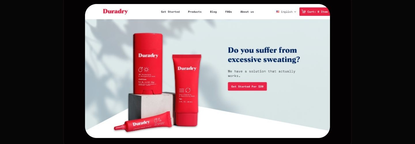
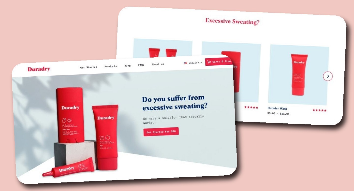
Duradry homepage hero with three red products on a pale blue ground with leaf shadows, a headline asking do you suffer from excessive sweating, and a red Get Started For 20 dollars button.
The hero names the condition outright, then answers it in one line, so sufferers know instantly this page is for them.
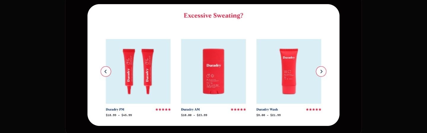
Product carousel showing Duradry PM, AM, and Wash on pale blue tiles with star ratings and price ranges under an Excessive Sweating headline, with blank space where intro copy sat.
PM, AM, and Wash sit side by side with price ranges, framing three products as one treatment rather than a catalog to compare. The placeholder intro line under the headline is masked in this slice.
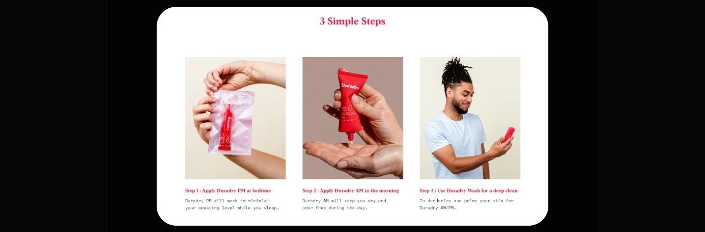
3 Simple Steps section with three photos, hands opening a PM sachet, applying AM cream, and a man holding the wash, each with a step caption.
The routine is compressed to three photographed steps, bedtime, morning, wash, so the regimen reads as habit, not homework. The dummy intro paragraph under the headline is masked in this slice.
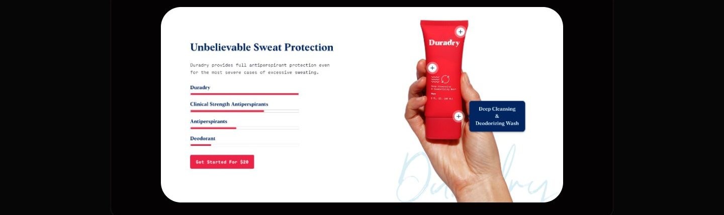
Unbelievable Sweat Protection section with horizontal bars comparing Duradry to antiperspirant categories, beside a hand holding the red wash tube.
A bar comparison against clinical antiperspirants and deodorants turns the strength claim into one picture. The bars carry no numbers, they rank the categories rather than measure anything.
Delivered when you need it section, photo of a woman holding a Duradry tube beside four icon benefits and a red Get Started button.
Delivery framing leads with choice, buy once or auto refill on your schedule, defusing the lock-in fear before checkout.
Testimonial section with two smiling people holding a Duradry product beside a monospaced customer review, reviewer name masked, under an Easy to apply headline.
One long first person review does the emotional work the comparison bars cannot. The quote is content I did not collect myself, so the reviewer's name is masked in this slice.

How I planned to test it

Find the main productsCompare product benefitsLearn the 3 step routineCheck other people's reviewsConfirm free shipping

A moderated walkthrough of these five tasks could show whether the page's information scent holds, whether a first time visitor can locate the products, the routine, the reviews, and the shipping answer without help. It could not show whether a skeptical buyer would pay, stay subscribed, or believe the clinical claims.

What follows is a plan for testing a concept, not a record of sessions. No participants were recruited, so no claim in this study is backed by live usage.

Appendix: foundations and system

The system underneath the page: a red-forward component library and a twelve column desktop grid that keep a long single page feeling like one product.
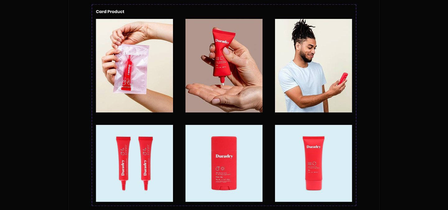
Card Product sheet with six tiles, three lifestyle photos of people using Duradry above three packshots of red products on light blue squares.
Product cards pair lifestyle photography with flat packshots on pale blue, one card grammar covering both education and shopping.
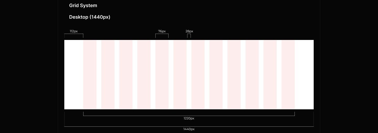
Grid system spec showing a 1440px desktop frame with twelve pink columns, labeled 112px margins, 76px columns, 28px gutters, and a 1220px content width.
A 1440px desktop grid, twelve columns with 112px margins and 28px gutters, disciplines every section of the long page.
Next storyOh Snap →