Case study 10 of 10 · Mobile app and UI kit · Independent concept project

Oh Snap

Creators plan trips with strangers from the internet. The app has to make that feel organized and safe.

2 min read
Role
Sole UX/UI designer, end to end
Type
Independent concept project
Year
2020
Platform
iOS mobile app
Scope
Competitor analysis, user flows, UI kit, hi-fi UI, heuristic evaluation
Industry
Travel and creator collaboration
Authorship

Oh Snap is an invented product that exists only in this concept study. Every part of it, from the brand and UI kit to the research, flows, and screens, is my own unaffiliated work, never commissioned by anyone and never shipped.

The hard part

Turning a chat between two strangers into a structured trip with dates, a location, and an accept or decline decision.

Look for

How the invite flow, the pending and approved states, and the shared post credit line all reinforce the same collaboration model.

Collaboration lives in DMs, and DMs lose trips

Creators who want to shoot together have no tool that combines finding a partner, planning the trip, and crediting the result. Instagram and TikTok surface creators but stop at tagging. Airbnb and Couchsurfing handle travel and trust but are not social platforms. The plan itself, who, where, when, always falls back to unstructured chat.

  • No collaboration tools built for creators, only generic tagging and duets.
  • No integrated trip planning to coordinate shared shoots and activities.
  • Thin identity and safety signals when deciding whether to travel with someone.

A competitor analysis of Instagram, TikTok, Airbnb, Couchsurfing, and Klook mapped where social reach, trip planning, and trust features fail to overlap.

One collaboration model, carried through every screen

From the first invite to the published post, the same structure repeats: a named partner, a place, a date, and a visible status.
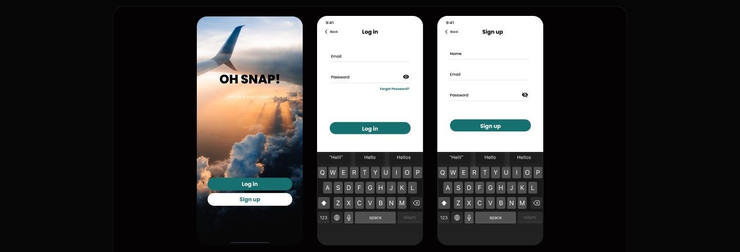
Three iPhone screens: a splash with an airplane wing photo and Oh Snap wordmark, then log in and sign up forms with teal buttons and static keyboards whose suggestion strip reads Helli above empty fields.
Entry keeps to two actions on a full-bleed travel image, then plain email forms with password visibility and recovery. The open keyboards are static components pasted from the kit, suggestion strip included, with no field actually focused.
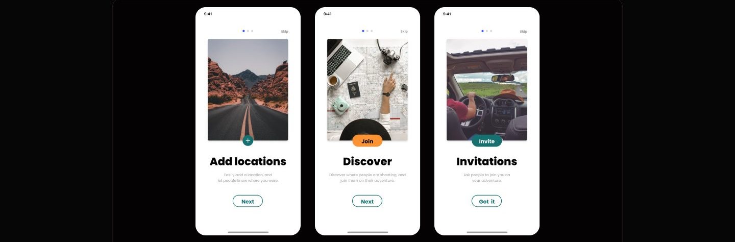
Three onboarding screens with travel photos and bold titles reading Add locations, Discover, and Invitations, each with a Next or Got it button.
Onboarding teaches the three verbs that matter, add locations, discover, invite, one per screen with a matching pill CTA.
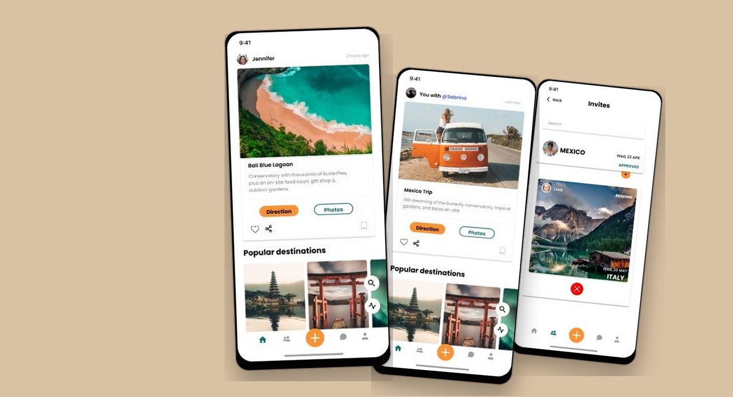
Two feed screens side by side, one showing a stranger's Bali post, the other a Mexico Trip post credited You with @Sabrina above a camper van photo.
The feed before and after a first collaboration: generic destinations become posts credited You with @Sabrina, with Direction and Photos actions.
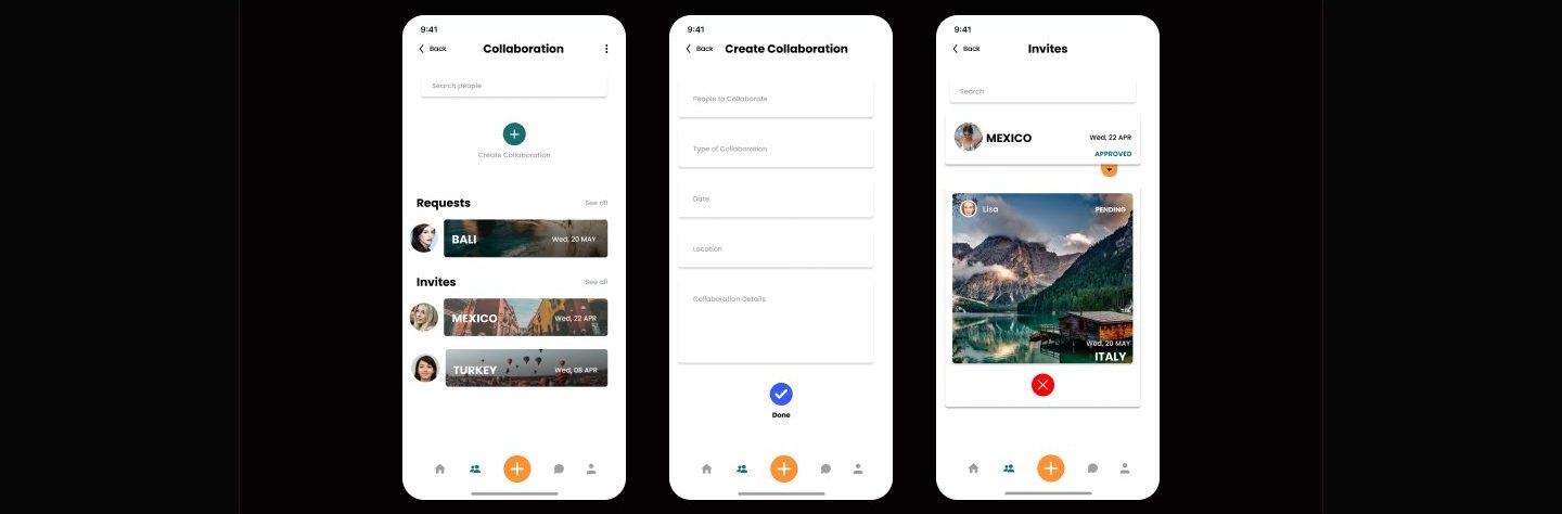
Three screens: a collaboration hub listing Requests and Invites, a Create Collaboration form with labeled fields, and an Invites list with approved and pending trip cards.
Collaboration is a form, not a thread: partner, type, date, location, details, then Requests and Invites tracked as approved or pending.
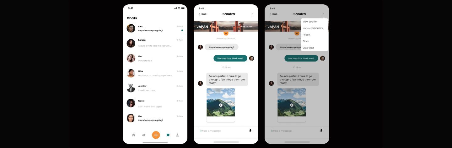
Three messaging screens: a chat list, a conversation about a Japan trip with a shared video, and the same chat with a menu showing Invite collaboration, Report, and Block.
Chat carries the escalation path: the overflow menu offers Invite collaboration next to Report and Block, so trust and planning sit together.

The walkthroughs I scripted but never ran

Invite a collaboration from homeTurn a chat into an inviteFill in the collaboration formPost the trip and credit your partner

Run as scripted, these walkthroughs could show whether people find the invite entry points and read the pending and approved states correctly. They could not settle whether two strangers would trust each other enough to travel together, which is the bet the whole app makes. The only evaluation that did happen was my own heuristic pass, which produced small clarity fixes.

This chapter is a scripted plan for evaluating a concept, not a report of moderated sessions: no participant ever sat down with Oh Snap, and nothing here carries the weight of live usage.

Appendix: foundations and system

The UI kit is what keeps a five-tab app with this much photography from drifting. Cards, navigation bars, inputs, and buttons were built once and reused across every flow.
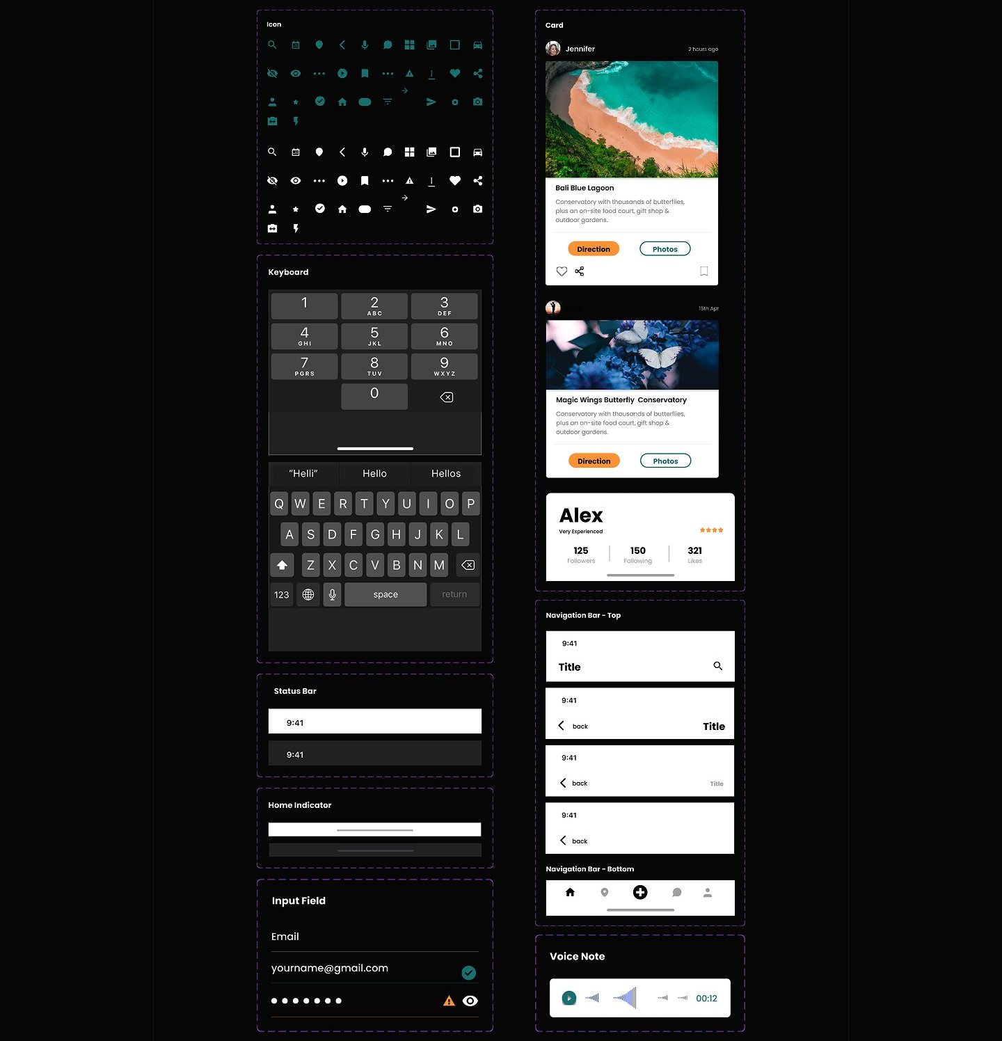

A UI kit sheet on a dark board with dashed outlines around each component group, showing teal icons, number and text keyboards, two destination post cards, a profile stat card, stacked navigation bar variants, and a voice note component.
The kit sheet straight from the working file, dashed group outlines still visible: icon set, keyboards, status bars, destination cards, a profile stat card, nav bar variants, and a voice note player.
A button component sheet showing orange and teal pill buttons in filled, outlined, text-only, and circular icon variants, including muted disabled states.
Buttons pair orange and deep teal across filled, outline, text, and icon variants, with disabled states defined up front.
Next storyHM →