Case study 02 of 10 · Analytics dashboard · Independent concept project
Sanctify
An analytics dashboard and the system behind it: Catholic values screening made inspectable.
5 min read
An unsolicited concept study built around Sanctify, an existing Catholic values screening product. The brand, name, and product belong to their owners; the research, flows, screens, and system work shown here are my own exploration and were never commissioned, endorsed, or shipped.
Making a moral screening score feel trustworthy meant showing its math: every rating breaks down into named categories with visible sub-scores.
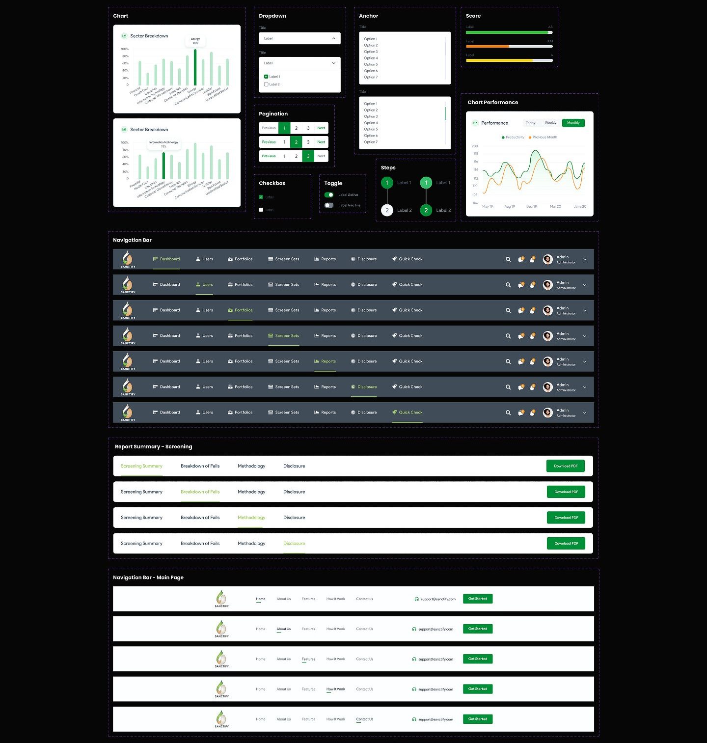
How one component language, rating rings, score bars, sector charts, holds together across the marketing site, both dashboards, and the app.
Ethical screening tools hide the one thing users came for
An investor who wants a portfolio aligned with Catholic teaching has no simple way to see why any company passes or fails. Sanctify is a screening platform that rates companies against Catholic moral categories, with a marketing site, a user dashboard, an admin dashboard, and a mobile app. The design problem was less about charts and more about trust: the score only works if its reasoning is visible.
- Faith-based competitors keep their screening methodology opaque, so users cannot verify the rating.
- Most tools show no dashboard preview before signup and little data visualization once inside.
- Financial products bury non-professional investors in jargon and complexity.
Desk research compared Inspire Investing, Eventide, and GuideStone Funds on messaging, transparency, and data visualization, which surfaced the pain points above.
The calls that shaped it
Every grade opens into the screens that produced it
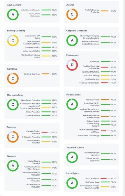
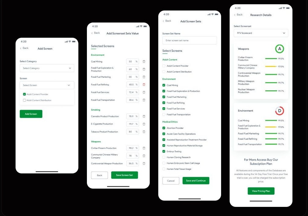
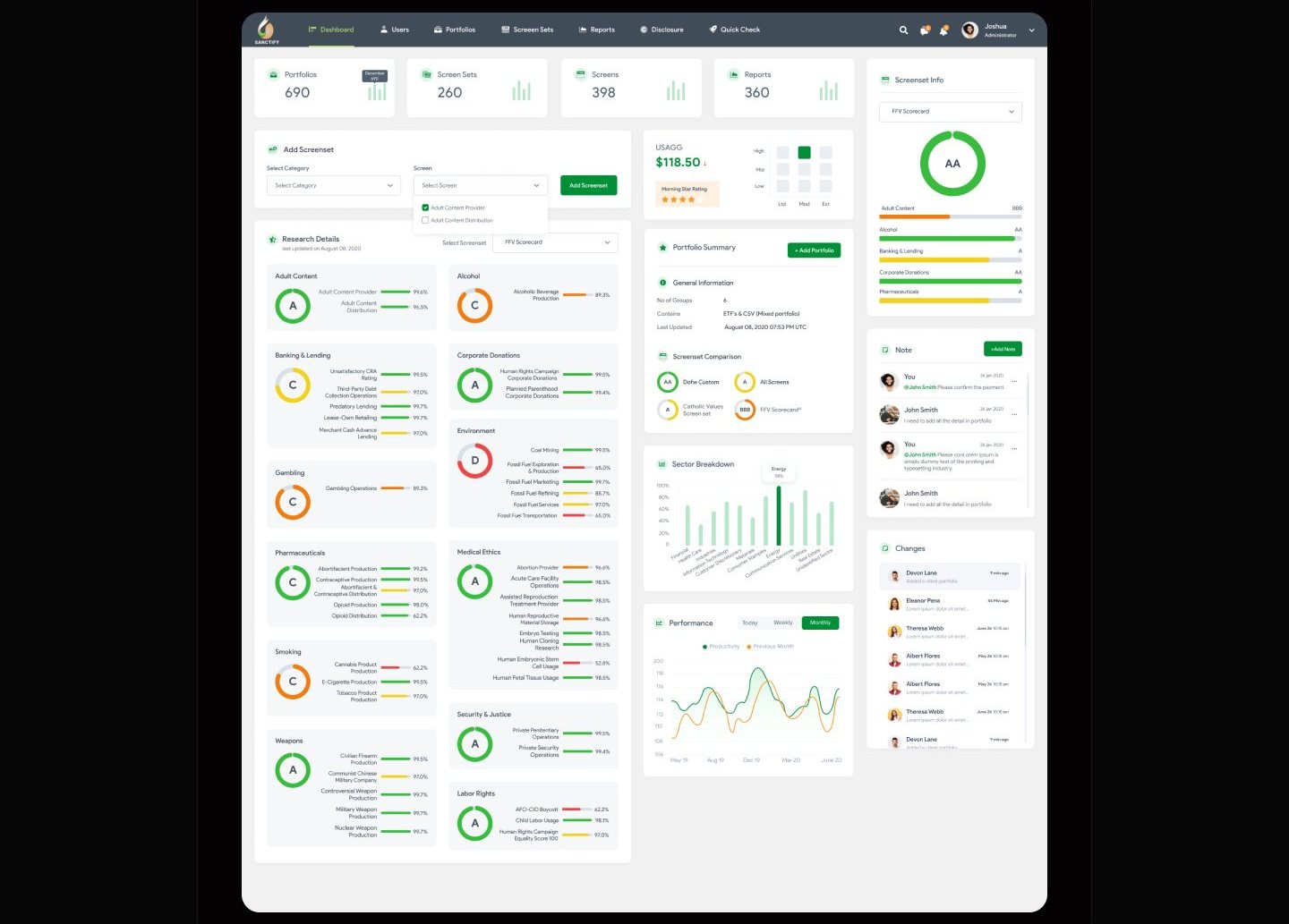
A composite moral score is credible only while it can be decomposed on sight, so decomposition is the dashboard's default state, not a drill-down. The competitor scan put opacity at the top of the pain list: Inspire Investing and Eventide both keep their screening methodology hidden behind the score. Sanctify answers structurally. Research Details renders all twelve moral categories as cards, each pairing a letter grade ring with a labeled bar for every underlying screen, and the Screenset Info panel repeats the same anatomy beside the headline rating. The rejected alternative was the industry default, one composite score with a methodology page a click away, which is simpler to lay out but asks users to leave the screen to interrogate the number, exactly the move that reads as marketing. The accepted cost is density: twelve open cards make the dashboard long, and scanning it takes visibly more effort than a single reassuring number would.
A weight field hands the moral policy to the investor
Checkboxes decide what gets screened, but only weights decide what matters, so the builder makes every included screen carry a user-set value. The screenset builder runs in four mobile steps: pick screens by category, weight each one, name the set, then read the graded report. The second step is the decision. Each selected screen, grouped under headings like Environment, Smoking, and Weapons, carries an editable value field and a delete control, so an investor encodes how much each concern counts in their own policy before the report grades it. The lighter alternative was to stop at the first screen's checkbox pattern, include or exclude and nothing more, which would have flattened every concern to equal importance and quietly made the platform the moral authority. The accepted cost is friction: a four-step flow with a numeric decision per screen asks more of the user than a one-screen picker ever would.
The marketing page previews the product with real components
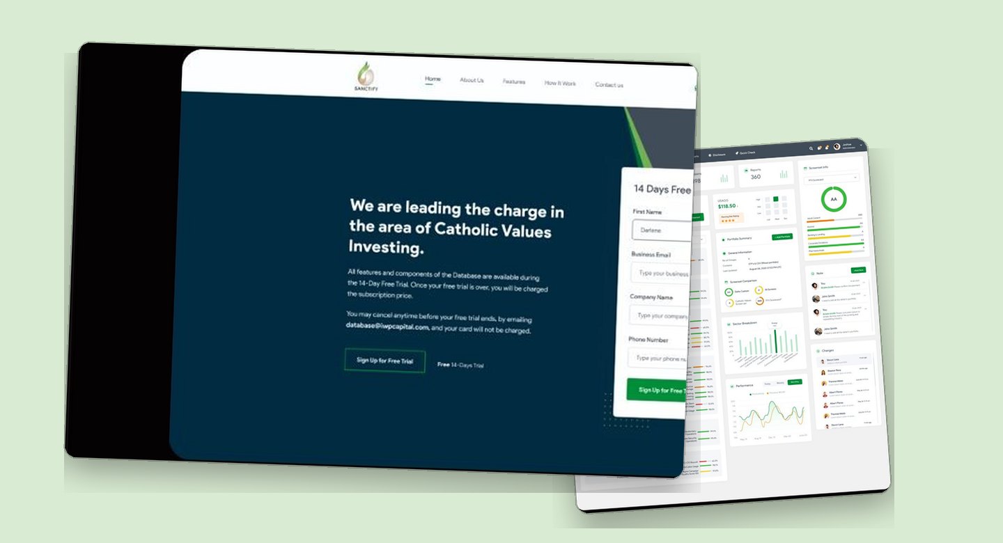
The clearest gap in the scan, no dashboard preview before signup, was closed by rebuilding dashboard components inside the marketing page itself. Every competitor reviewed hid the product until after registration: Eventide requires an account to see its dashboard at all, and none of the three showed working data visualization up front. Sanctify's marketing sections carry the actual component kit instead, a Screenset Information card with its rating ring and category bars, a sector breakdown chart, and a market value card, sitting beside the value proposition. The rejected alternative was the safe one, stylized illustrations or a gated demo, which would have kept the page easy to maintain but contradicted the transparency claim in the headline directly above it. The accepted cost runs two ways: the marketing page inherits product upkeep forever, and in this concept the supporting body copy beside the components is still placeholder text, plainly visible in the figure.

Show the score's work, everywhere the score appears
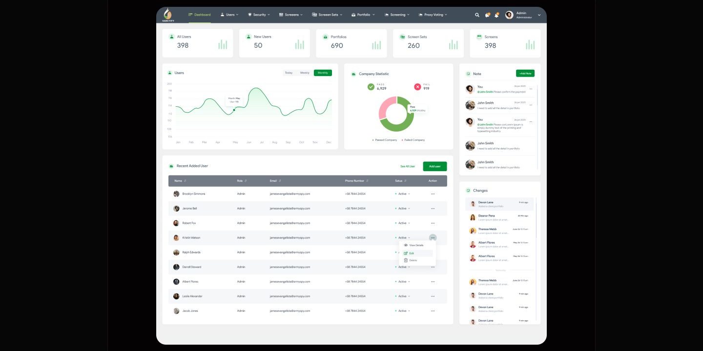
One green-led component language carries the moral rating from the first marketing touch to the deepest dashboard card.


How I planned to test it
Walking a participant through these five tasks could show whether the trial signup, the screenset builder, and the graded report each read as intended on first contact. It could not show whether real investors would trust these scores with real money, and the boards record no sessions, no participants, and no findings.
This chapter is the test I designed, not a test I ran: no participant ever sat with these screens, and no claim in this study rests on observed behavior.
What I learned
Transparency is a component decision before it is a copy decision. The rating ring, the letter grade, and the labeled score bar carry the openness claim on every surface, from the marketing page to the deepest dashboard card, so trust never depends on a paragraph the user has to take on faith.
A weight field changes who owns the ethics. Include or exclude checkboxes make the platform the moral authority, but the value step in the screenset builder hands that authority to the investor, and the graded report that follows measures their policy rather than a house verdict.
Placeholder content is a debt the captions have to declare. The note panels, the repeated user row, and the lorem body copy were scaffolding left in these boards, and naming them plainly costs a study less than a reviewer discovering them unannounced.
Appendix: foundations and system
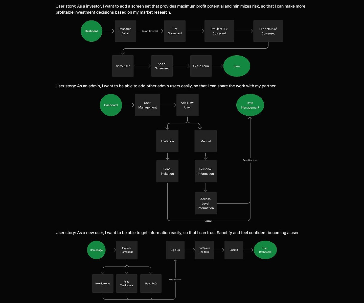
The flows and component sheet show how four surfaces stayed coherent. Every screen above is assembled from this one kit.